Projects
By centering the development around the user, one can ensure that the solution is fitted to the user and not the developer.
By user testing the solution during development, one can easily follow data and fit the solution better to the user group.
By developing iterative, one can ensure a continuous focus on the problem and the user.
Human interaction with technology
Promoting health habits with subliminal perception
A group project at Aalborg University
Problem space
In this project we investigated if peoples hedonic perception of the taste of water can be subliminal influenced.

Analysing the problem
The first thing we did was to research the problem space. First we investigated human perception of light(Fasting and Hougaard, 2007). Thereafter we looked at human processing of the world by respectively bottom up and top down processing. This led to an investigation of cognitive schemas(McLeod, 2015), cognitive dissonance(Dalsklev and Emiot, 2014), and conditioning(Larsen, 2014). Hereafter we looked into the difference between subliminal and supraliminal perception(Pashler, 2013), and how one can prime people with the use of subliminal messages.

Creating and testing prototypes
A prototype is created in Processing to find the limit between subliminal and supraliminal perception of the target and the mask. During this, we find an average limit at 13,67% opacity of the target. This average are then used in an second experiment. The participants are initially told that we are testing the influence of concentration on the taste of water. But really we are dividing them into 3 groups: one control, one with a static subliminal picture of water, and one with a dynamic subliminal picture shown 16 ms of each second. This division is done in order to test if the perception of water differs between the groups.
Conclusion
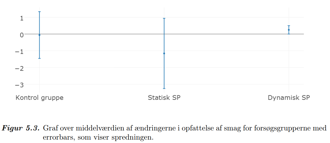
With the help of a statistical test we find that the group affected with dynamic subliminal perception perceive the water better after the experiment (p=0,076%). There are no significant differences in the other test group(p=0,28%) and in the control group(p=0,91%).
References
Dalsklev og Emiot, 9. august 2014. Madeleine Dalsklev og Karen Emiot. En tankevekkende studie av kognitiv dissonans. Psykologisk.no, 2014. Senest besøgt: 19-12-2014
Fasting og Hougaard, 2007. Ulla Fasting og Jørgen Hougaard. Fysiologi og anatomi: Det levende menneske. ISBN: 978-87-628-0349-7, første udgave, første oplag. Munksgaard Danmark, 2007.
McLeod, 2015. Saul McLeod. Jean Piaget. 2015. Senest besøgt: 27-10-2015
Larsen, 2014. Ole Schultz Larsen. Psykologiens Veje. ISBN: 9-788-761-60930-4, Paperback. Systime, 2014.
Pashler, 2013. Harold Pashler. Encyclopedia of the Mind, 2013
Technology and knowledge
IntraVik - improving VikingGenetics intranet
A group project at Aalborg University
Problem space
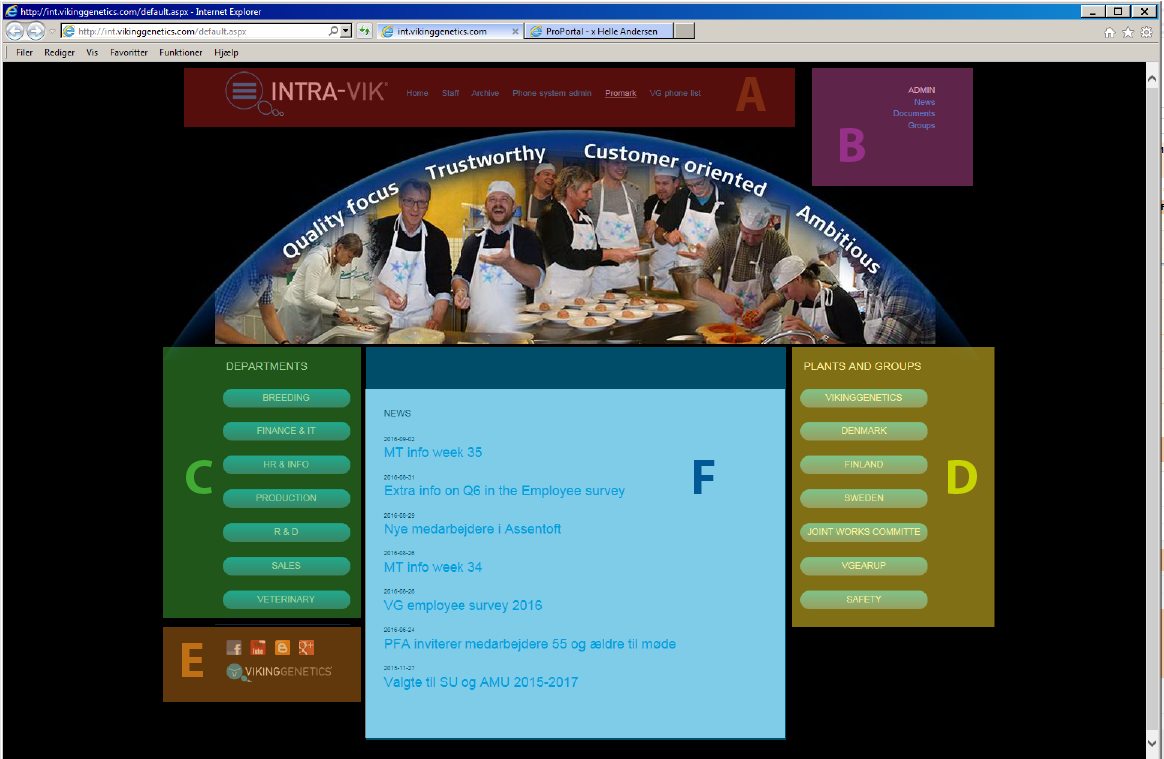
During this project we worked with VikingGenetic on improving their intranet, IntraVik, in a user-centered way. This is done by first identifying the problems through interviews with the users, the employees of VikingGenetics. These problems are used as the basis for the improvements to IntraVik.
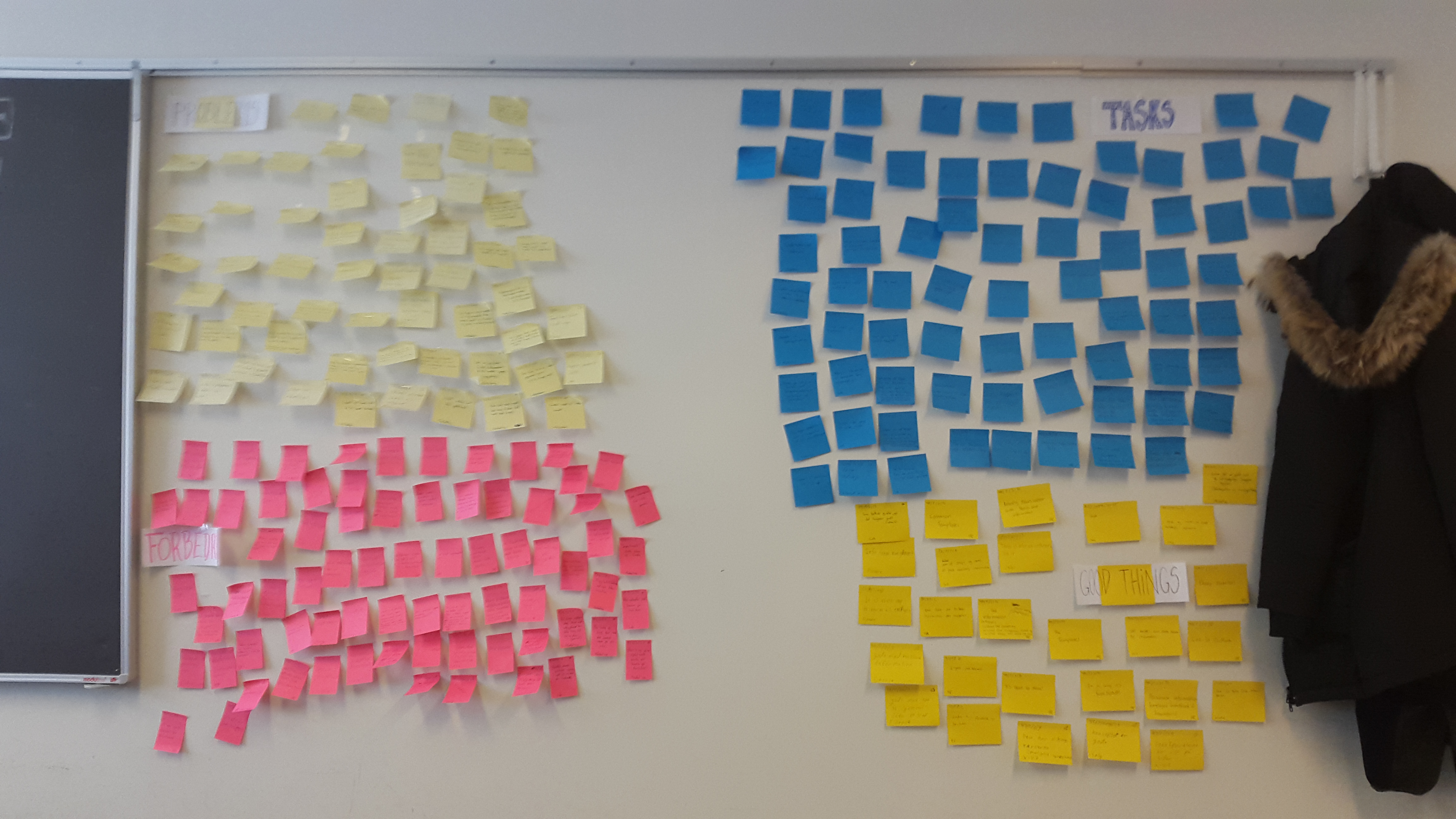
Analysing the problem
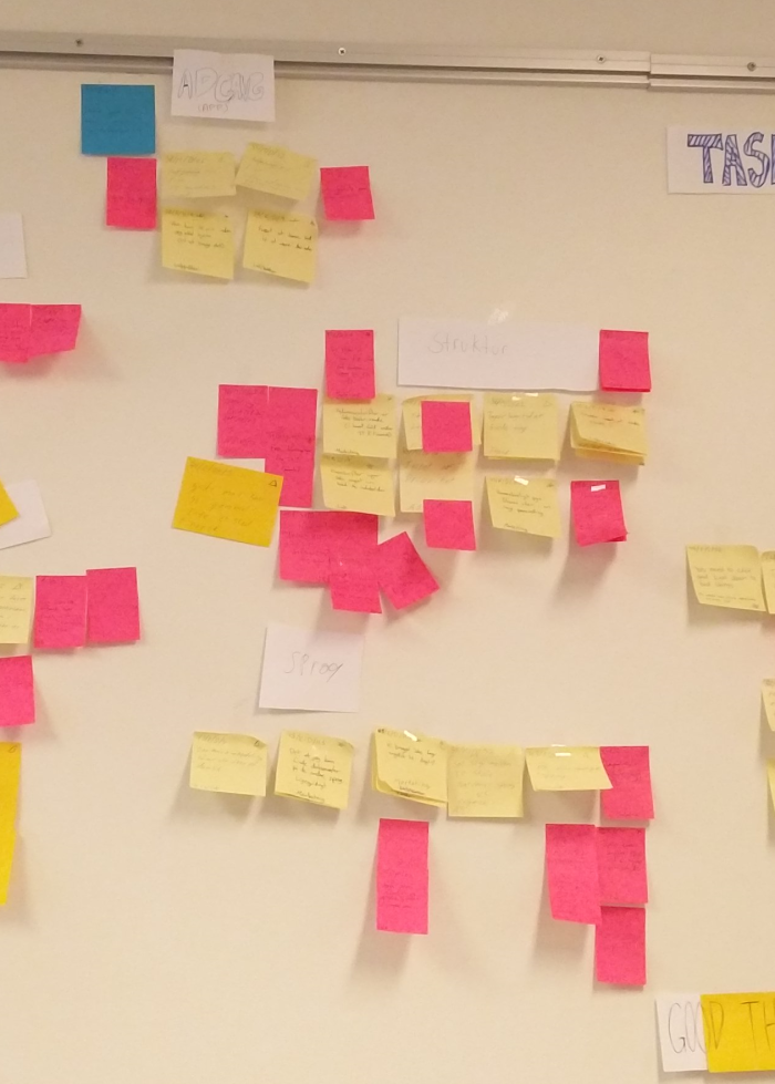
A draft for a new design was made, based on cognitive psychological and UI theories, and tested through a process of Lo-Fi prototypes and a workshop. In the end a hifi prototype with all these changes was made to test if the changes had a positive effect on it's users' satisfaction, cognitive load and navigation.
Conclusion
The tests found greater satisfaction through the interaction with the prototype, however no overall significant changes were found in the time spent nor the number of clicks used to complete tasks in either designs.

Human and device
Motivation for Rehabilitation - Increasing Motivation for Rehabilitation with a wobble board at Home Using Exergaming
A group project at Aalborg University
Problem space
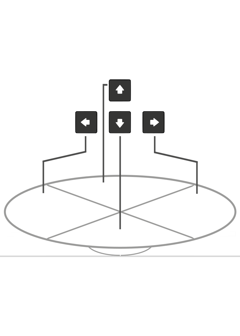
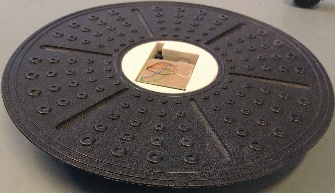
The purpose of the project is to determine if it is possible to increase motivation for use of a rehabilitation device. It was chosen to test with a wobble board and exergaming.
User testing
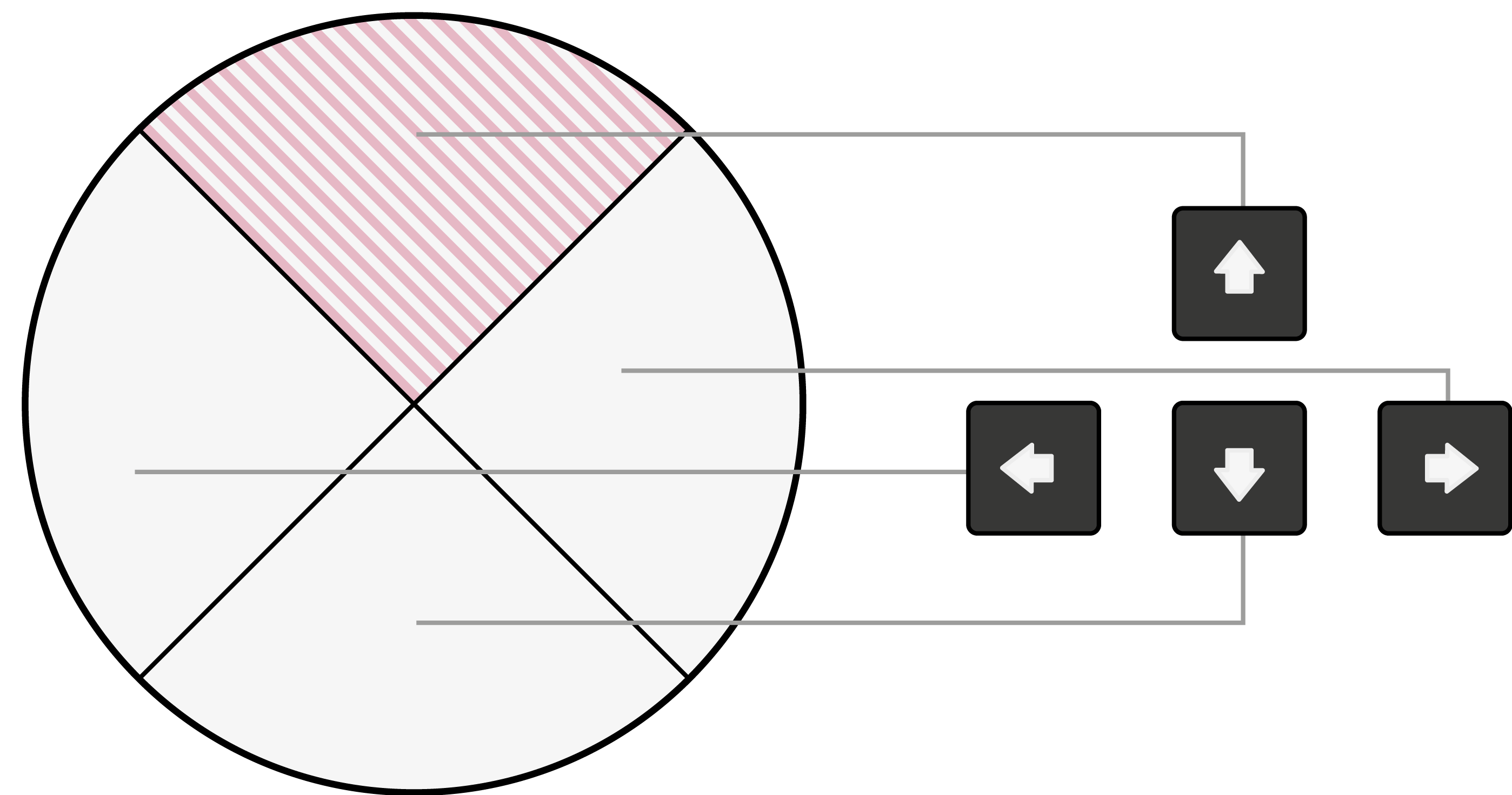
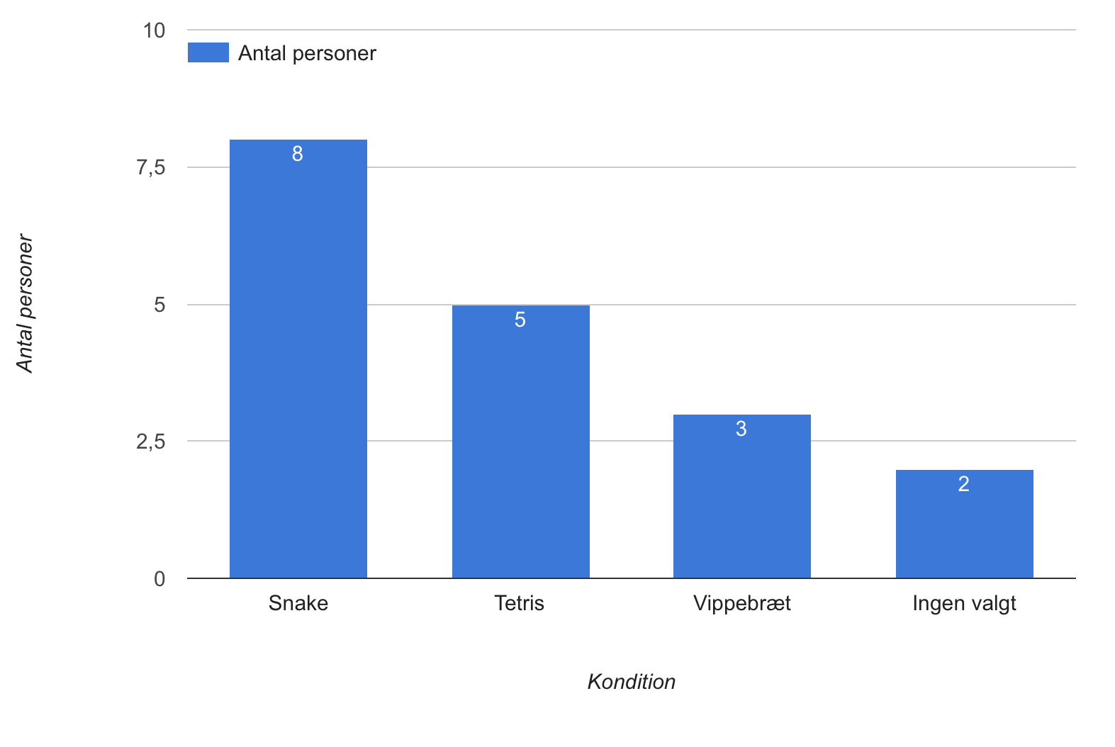
Through use of motivation and exergaming theory in the context of rehabilitation, there is carried out an experiment to see whether these can improve a wobble board. The experiment is carried out by having participants interact with a wobble board in three conditions: Snake, Tetris, and control. The participants answered a series of statements regarding their motivation for using the device in the respective condition.
Conclusion
It can not be confirmed that exergaming will make a wobble board more motivating, but there seems to be a tendency for people to be more positive towards the conditions with games.
Bachelor project
Design of configuration - a rebreathing device for migraineurs
A group project at Aalborg University
Problem space
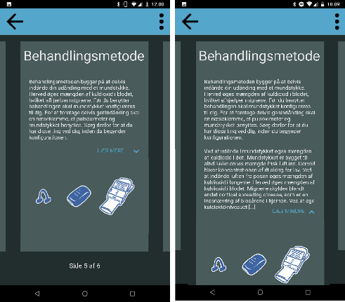
The company BalancAir, has developed a drug free migraine treatment that focuses on partial rebreathing to combat migraine attacks. The treatment needs to be configured to find the setting that matches the specific migraine patient to ensure the best effects with the least amount of negative side effects. The goal of this project is to find a method for guiding migraine patients to find the optimal setting for their own device. The suggested solution for this project is to do this through a mobile application.
Analysing the problem
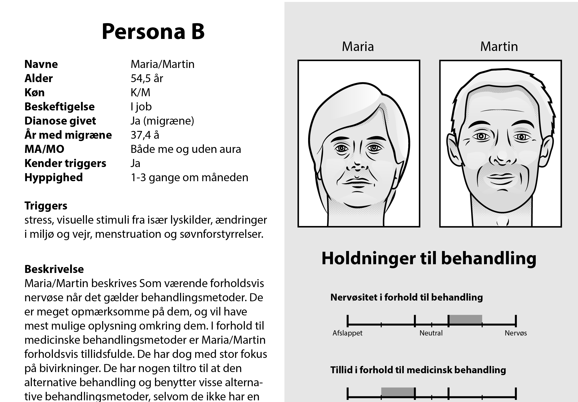
To gain an understanding about the target group, interviews with ten migraine patients are performed. The data is analysed and compared with data collected by the company, epidemiology and demography. Together this information is used to construct personas and perform a task analysis to determine who to design for, and what their needs are. To gain an understanding of the elements included in the treatment a usability test is performed to investigate the mental model for test subjects that are comparable to the persona. Based on personas(Cooper et.al. 2014), task analysis(Komninos,2018) and the usability test(Greenberg et.al. 2012) an interaction framework is designed. This is tested on three subjects through a test of the interaction framework. Issues with some interactions are found, and these are tweaked together with the addition of the visual design framework and a refinement phase. Based on this a working prototype is constructed.
User testing a hifi prototype
The prototype is tested on five subjects. Their interaction with the prototype is observed. At the end of the test the subject rates the application through a System Usability Scale (SUS), and their insights is collected through an interview. The SUS scores are found to have a mean of 85 (CI: 72-97), showing that the users rate the application as being an acceptable design. The observations and interviews found some issues within the design. These are discussed and ideas for solutions are presented. Based on this it is concluded that the interaction and usability of the prototype is evaluated as user friendly, but there is a need for further research and improvements to solve the issues presented.
References
Johansen, Troels (2017). „Pulmonary Gas Exchange and Blood Gas Tensions: NewFrontiers in Imaging, Diagnosis and Treatment“. Ph.d.-afh. Aarhus University. Kap. 4
Komninos, Andreas (2018). „How to improve your UX designs with Task Analysis“. I:Interaction Design Foundation.
Cooper, Alan, Reimann, Robert og Cronin, David (2014). About Face - The Essentialsof Interaction Design. 4. udg. John Wiley & Sons, Incorporated, s. 44–55, 61–71,101–115, 119–134, 241.isbn: 9781118766576
Greenberg, Saul et.al. (2012). Sketching User Experiences: The Workbook. English, s. 217–226.isbn: 978-0-12-381959-8.doi:10.1016/C2009-0-61147-8
Interaction
Investigation of the factors that influences changes in the preferred listening level
A group project at Aalborg University
Keywords: probe experiment, card sorting, laboratory experiment, iterative testing,
Purpose
Unsafe listening is a problem that can cause hearing loss. The purpose of this project was to exploratively determine what makes people change their listening level in order to help designers of listening devices accommodate for peoples preferred listening levels. These factors are investigated with the help of a probe experiment(n=29). Furthermore a laboratory experiment is conducted in order to uncover whether the preferred listening level is a fixed level or a continuum, and whether different people have similar preferred listening levels.


Method
Liquorice tootsie roll gummies oat cake. Topping dragée cookie powder donut carrot cake donut chocolate cake carrot cake. Gingerbread gummies jelly beans. Sweet roll marshmallow pastry cheesecake fruitcake halvah sweet roll sweet roll chocolate bar. Lemon drops cotton candy danish muffin lemon drops tiramisu. Biscuit jelly-o jelly soufflé bonbon wafer dessert. Jujubes jelly topping carrot cake gummi bears chocolate cake gummi bears halvah.
Gingerbread gummies
Liquorice tootsie roll gummies oat cake. Topping dragée cookie powder donut carrot cake donut chocolate cake carrot cake. Gingerbread gummies jelly beans. Sweet roll marshmallow pastry cheesecake fruitcake halvah sweet roll sweet roll chocolate bar. Lemon drops cotton candy danish muffin lemon drops tiramisu. Biscuit jelly-o jelly soufflé bonbon wafer dessert. Jujubes jelly topping carrot cake gummi bears chocolate cake gummi bears halvah.

References
B. Gaver, T. Dunne, and E. Pacenti, “Design: Cultural probes,” Interactions, vol. 6, pp. 21–29, January 1999.
R. K. Yin, Qualitative Research from Start to Finish. NewYork, N.Y: Guilford Press, 2011. ch. 8-9.
British society of Audiology, Recommended Procedure -Pure-tone air-conduction and bone-conduction threshold audiometry with and without masking, 2012
Millisecond Software, “User manual for inquisit’s paced auditory serial addition test.” https://www.millisecond.com/download/library/v5/pasat/pasat/pasat.manual.
Master thesis
Improving Studi.ly - a Microsoft Teams application for schedule, homework, assignments, and study plan
A master thesis by Ruth in cooporation with InLogic
Problem space
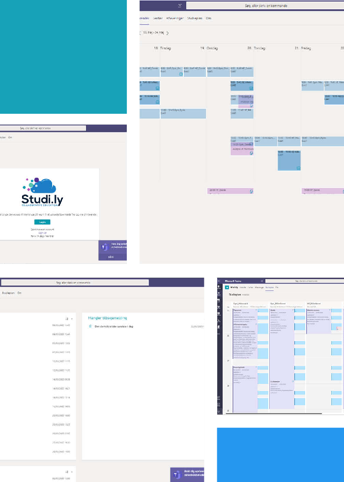
In this project I worked with InLogics new application, Studi.ly. So far the focus of development has been on the teacher as a user. But the system is intended for both teachers and students, therefore I choose to look at the student during my master thesis. My master thesis consisted of 3 different investigations: a questionnaire, an expert evaluation, and a user test.
Questionnaire - how do danish student percive their digital learning enviroment?
49 variables investigated
The questionnaire investigates students' use of digital technology and learning platforms. The variables are found during a review of two british studies (Ozkan og Koseler, 2009 and Al-Fraihat m.fl.,2020) and a danish study of digitalisation of gymnasiums(Danmarks evalueringsinstitut,2018).
Multiple factor analysis
The data is analysed with a multiple factor analysis, which is a statistical tool to perform dimension reduction and thereby make sense of big data sources in order to find the underlining tendencies.
Conclusion
There is a correlation between the teacher's attitude towards the digital platform and the fact that the platform has correct and up-to-date content. Students differ based on whether they find technology a support or an obstacle for learning. There is a correlation between teachers advertising communicating during the digital learning platform and the students' use of the platform for communication.
Expert evaluation
Method
Because of the world spanning epidemic, covid19, I had to adapt my thesis to avoid as much direct user involvement as I wanted. A structural way of improving the user experience of an interface is with an expert evaluation(Benyon, 2014). In this investigating I first mapped the system with the help of a hierarchical task analysis(Stanton et.al., 2009). This analysis I then used to perform a cognitive evaluation. Hereafter I used Yin (2011)s iterative five phase model to analyse the collected qualitative data.
Conclusion
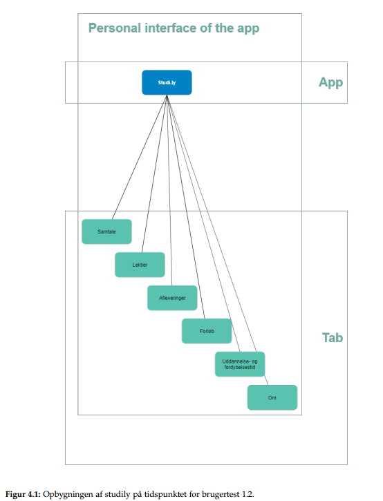
With this method I recorded 76 mistakes in the design. I also uncovered how some goals can be solved in multiple locations, which increases the students' possibility for success when interacting with the system. The system consists of four tabs plus modals. I uncovered that three of the tabs work much better than the last tab and the modals. Furthermore I uncovered one missing functionality and a variety of possibilities for improving the user experience by looking at indicators, signifiers and feedback.


User test
Method
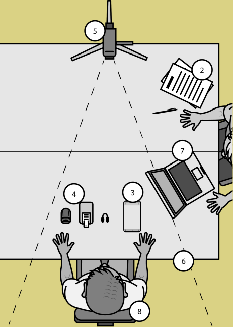
The user test investigate three parts: 1) how the modals work, 2) which part does the student use when handing in an assignment, and 3) which information does the student want in order to form an overview of their classes. This is investigated with a usability test and think aloud protocol. (Benyon, 2014 and Nielsen, 2012)
Conclusion
Based on this test it is confirmed that it is an advantage to have more than one path to each goal. There is also found a need for another iteration with the icons used in the design, in order to insure intuitive understanding of these. Furthermore there is enlighted what information students want in order to form an overview of their classes.
Conclusion
During this thesis I found a number of possibilities for improving the system for the student. I have tried how to improve usability with direct involvement of users by doing an expert evaluation. There are found missing usability elements (feedback, signifiers, indicators) in all tree investigations. From the questionnaire I found that the teachers attitude towards the system seems to affect the students attitude.

References
Al-Fraihat, Dimah m.fl. (2020). „Evaluating E-learning systems success: An empirical study“. English. I: 102, s. 67–86. issn: 0747-5632. doi: 10.1016/j.chb.2019.08.004.
Danmarks Evalueringsinstitut (2018). Digitialisering i gynmasiet set fra elevers perspektiv. https://www.eva.dk/ungdomsuddannelse/digitalisering-gymnasiet-setelevperspektiv-0.
Ozkan, Sevgi og Koseler, Refika (2009). „Multi-dimensional students? evaluation of e-learning systems in the higher education context: An empirical investigation“. English. I: 53, s. 1285–1296. issn: 0360-1315. doi: 10.1016/j.compedu.2009.06.011.
Benyon, David (2014). Designing interactive systems: a comprehensive guide to HCI, UX and interaction design. eng. Third edition. Harlow: Pearson. isbn: 9781447920113.
Stanton, Neville A m.fl. (2009). Digitising Command and Control: A Human Factors and Ergonomics Analysis of Mission Planning and Battlespace Management. eng. 1. udg. Routledge, s. 1–210. isbn: 9780754677598.
Yin, Robert K. (2011). Qualitative Research from Start to Finish. eng. New York, N.Y Guilford Press. isbn: 9781606237014.
Nielsen, Jakob (2012). Thinking Aloud: The #1 Usability Tool. https://www.nngroup.com/articles/thinking-aloud-the-1-usability-tool/.
Remote user testing
Testing a learning management system
Iterative developing at InLogic
Problem space
InLogic had rapidly developed Studi.ly based on demands from a customer. Therefore the focus had been on developing all the different functionalities. This meant that there was little focus on the UI and usability of both the functions and overall system.
Method
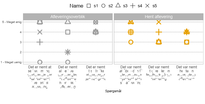
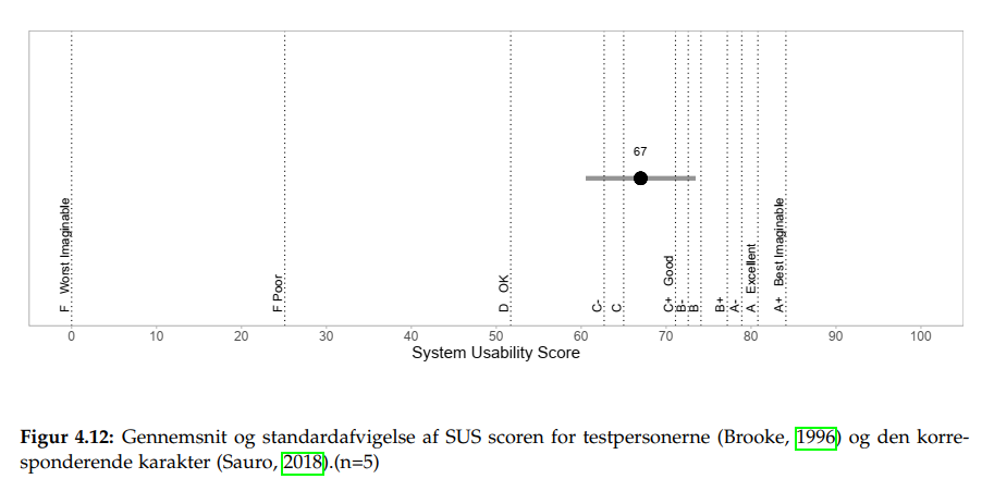
In order to improve the system I therefore performed a user test. In this test I asked test subjects to use the functions and then answer on a likert scale from 1 - strongly disagree to 5 - strongly agree, if the task was easy. By doing this I was able to map which functions that had most potential for improvement. It was desired to also use this test to uncover how far the developing process was in regard to creating an innovative user friendly system. Therefore I incorporated a System Usability Scale (Brooke, 1996) as part of the test. SUS is a quick and dirty way of measuring usability and learnability of systems. The test was administered with the use of Microsoft Forms on five test subjects, and R was used to perform data analysis.
Results
During the test both qualitative and quantitative data was gathered. Mean and standard deviation was calculated for each statement, and each person's SUS was calculated. The qualitative data was sorted. Based on this I defined improvements.
Conclusion
Based on this I advised InLogic to take a closer look at the danish translations and to look at the overall structure of the design.
Some of the improvements were simple such as changing what info is connected to each lesson in the calendar, and other was more comprehensive, such as improving the UI of finding each student's handin.
Additionally I was able to show that the process was on the right track with a mean SUS at 67, which is equivalent to C as a grade. This is acceptable given the fact that the system still is developing.
References
Brooke, John (1996). SUS: A quick and dirty usability scale.
Sauro, Jeff (2018). 5 ways to interpret a SUS score. https://measuringu.com/interpretsus-score/.
Pokemon Go
Development of a guide
A problem solving approach
Problem space
With the digitalisation of the world, people can use technology as an extension of their mind(Clark & Chalmers, 1998). This is relevant knowledge when designing, because it enables the designer to use technology to widen peoples mind.

Analysing the problem

Creating and testing prototypes

Conclusion
References
Clark, A., & Chalmers, D. (1998). The extended mind. Analysis, 58(1), 7–19
